

Designing a login page can be difficult if you don’t know where to start. There are many teeny-tiny details that can be overlooked and ruin the user experience, preventing the onboarding of new users. When you have no starting point whatsoever, it pays to get up to speed with the basics of login page design regardless of the type of website.
Those who want to build a beautiful and responsive login page should read this article thoroughly and pay attention to all the aspects discussed below. The good news is that login pages are not difficult to build, as long as you follow some basic rules. Learn below more about this topic in this article created by our team at Amelia.
Before jumping into the do’s and don’ts of login page design, you should know what these pages do in the first place. A login page is a door that users must open in order to get the best out of their experience with a website. It is the starting point of navigating a website in a personalized manner. By creating an account on a website, you get to customize some aspects of your experience with the site and get access to membership benefits.
Well-designed login pages should inspire a sense of security. A poor login page will immediately influence your conversion rate because people are not going sign up in the first place. Designing a login page properly is a condition of owning a website, considering that this page is most likely to be accessed by users at least once per browsing session. People who want to access their accounts can’t do it without reaching the login page, and if this page is not designed properly and it’s a pain to use, you’ll lose users.
Once you’ve figured out how important a beautiful and responsive this page is, it’s time to learn how to create a login page that makes users stay on the website and enjoy their experience. Here’s the list of do’s and don’ts:
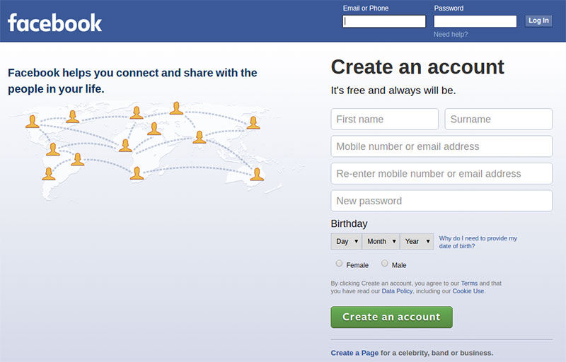
You can’t go wrong with a simple login form and clean design. Cluttering the page and making the login forms difficult to notice or to reach will make users leave the website. Try to keep the area simple and make it starkly visible, so that visitors can find it fast. Instead of creating a Log In/Sign Up button and redirecting users to a new page, you can incorporate a CSS login form on the homepage, to make it prominent and eye-catching, as well as convenient to use.
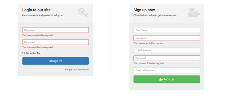
Some login pages don’t make a clear distinction between the login form and the registration form. Signing up requires gathering more information from the person who wants to create an account while logging in requires using your previous credentials and accessing your website. You need to make a clear distinction between the two, to avoid confusion. For instance, if a person tries to log in by using the registration form, they might get redirected to a page that has nothing to do with logging in, but instead asks them to sign up again.
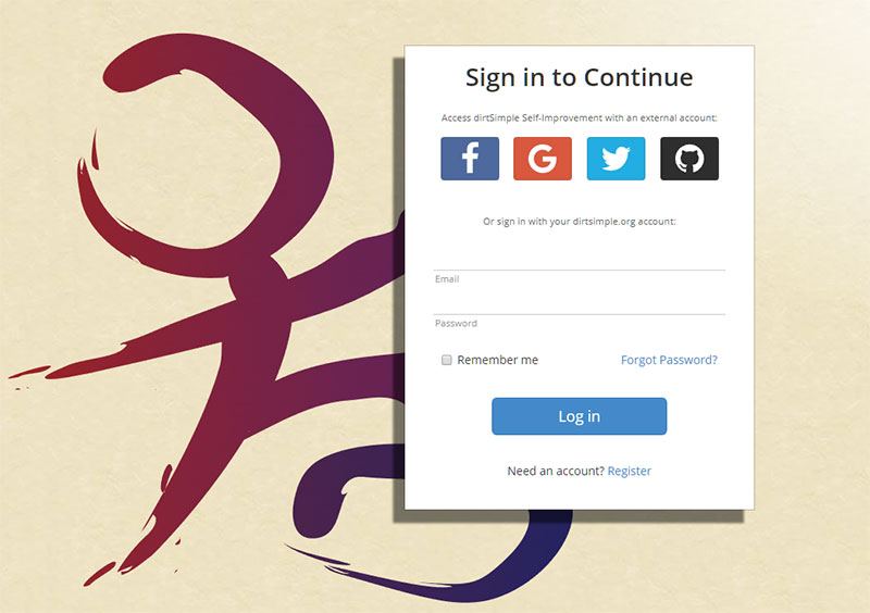
Taking into consideration that some people want to create an account as fast as possible, you need to give them plenty of sign-up options. Your login page should contain an option that lets people sign up on your website using an external account. This way, they won’t need to go through the lengthy registration process to make a purchase or add a comment on your site. Add options for linking with Facebook, Google, or Twitter accounts. Keep in mind that you may no longer receive all the contact details you would normally require through a registration form.
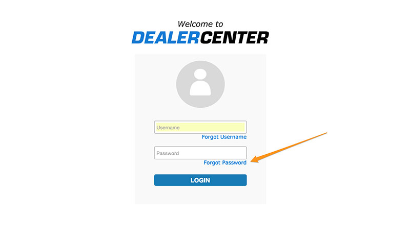
People forget their passwords quite often, and it would be a hassle to contact support just because you don’t remember yours. This is the reason why you’ll have to implement a “Forgot your password?” function. When users click it, they should receive a link in their email that lets them change their credentials and log in to the website without further issues.

Mistyping the password is a common practice, and it mostly happens because Caps Lock is on. As you may have noticed while using other websites, some login forms let people know if their Caps Lock is on, to avoid making typos while writing. This is a very helpful feature for websites that restrict the number of times an incorrect login can be entered before locking the user out.
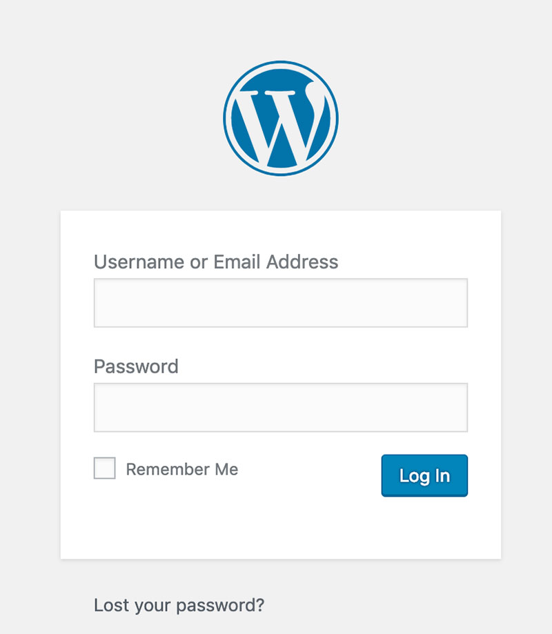
To reduce the number of people who request to change their passwords because they forgot them, it would be best to add a “Remember me” option at the end of the login form. Once checked, this option saves the credentials and each time that person accesses the page, their email and password will pop up in the form, or they will show up as already logged in.
Even though the “Caps Lock” solution is effective, you can also implement an option that unmasks the password while typing. If the unmask option is checked, the user will be able to see what they type in the field. If it is left unchecked, the traditional masking symbols will appear instead.
This image presents the wrong way of designing the Sign In and Sign Up buttons:
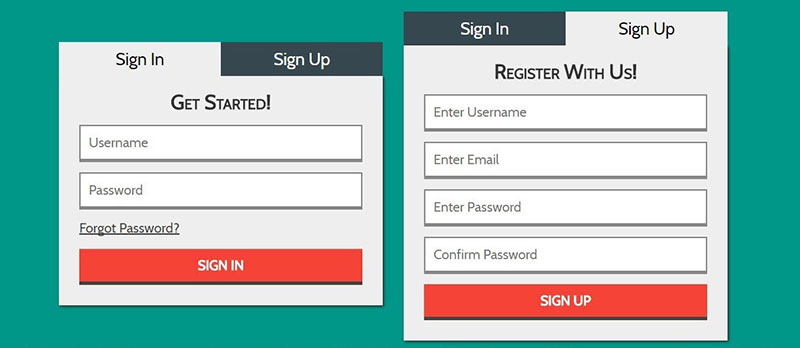
Instead of making them very similar, it’s best to differentiate these buttons and make it easy for the users to do what they’ve accessed the website for – to either log in or create a new account. Clicking one instead of the other by mistake could lead to a poor user experience by confusing the users and making them leave the website without further interaction. Use color, size, or some other contrast technique to make them visually distinct.
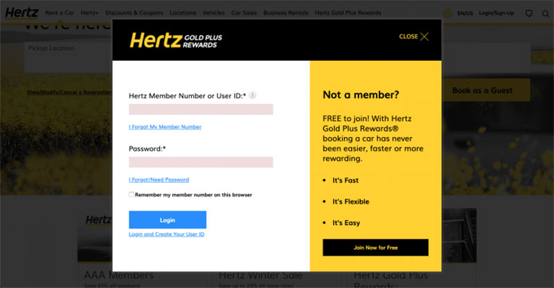
Using modal or tabbed logins is not a good practice because they require more steps from the user. They will need to click on the expandable menu, select login, and then fill out the form from there. Instead, a login page should contain the Sign In/Sign Up options separately. Moreover, modal logins might lead to more customer support demands, as users may get confused as to how to find the Sign In form (which may not be obvious).
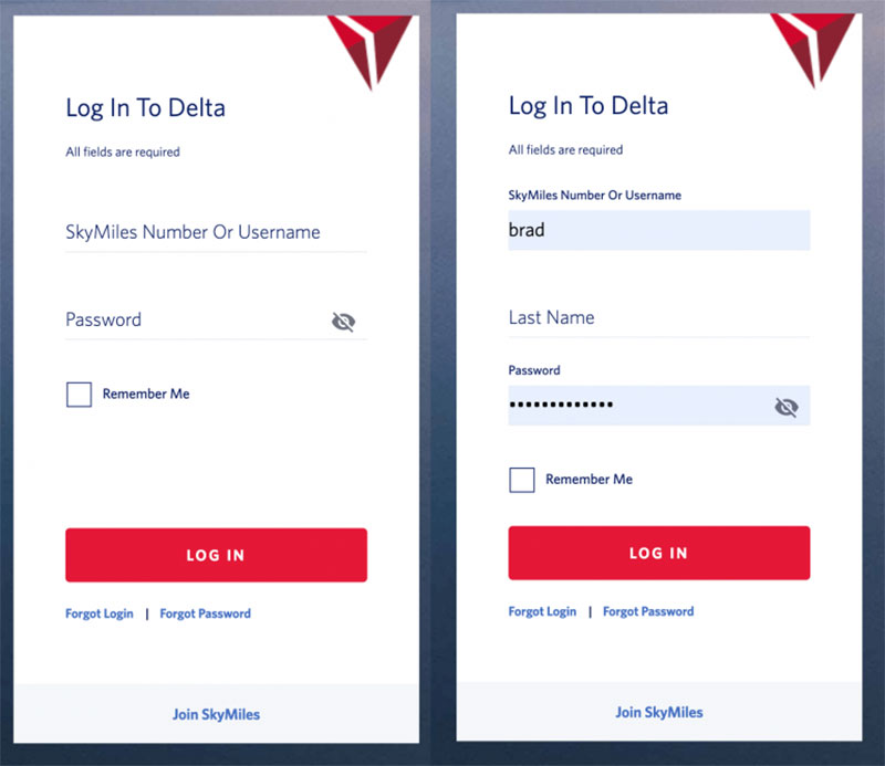
Hidden fields shouldn’t be hard to find or tricky to use. Some browsers can retain information that users type in when they register on a new website. To make the process easier and faster, the browser automatically fills fields that it recognizes, such as name, surname, address, phone number, and so on. If some fields are hidden or can only be accessed via a drop-down menu, the browser won’t be able to recognize the fields and autofill them. Most login page templates look the same, so try not to stray too far from the conventional elements of such a template.
In login form design, it would be recommended to ask people to sign in using their username instead of their email. This practice is not efficient because people are very likely to forget each username they use for each particular website they’ve accessed lately. Instead, using their email can’t go wrong because it remains the same regardless of what website they navigate on. This is not a general rule, but it is a better practice that is proven to generate less customer support requests.
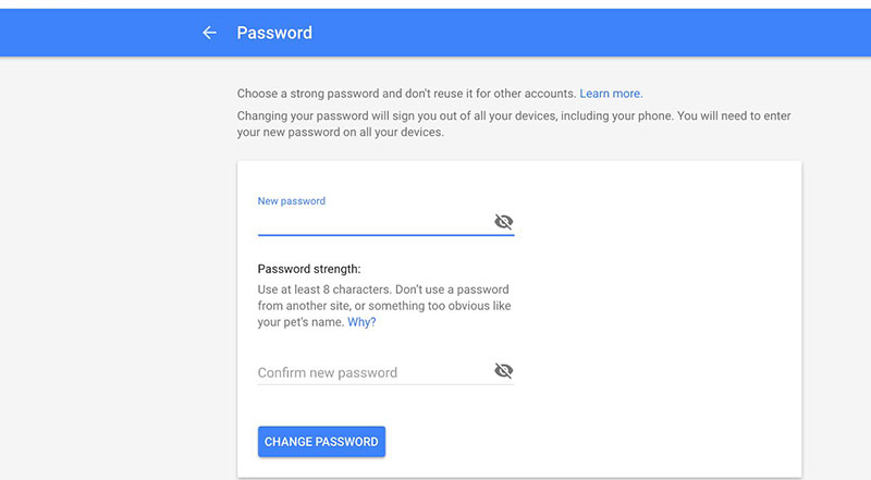
Taking into account how important cybersecurity is today, passwords should be as long and complex as possible. If your login page limits users to using an eight-character password, they might give up registering because their account won’t be as secure as they would like. Make sure that you set no max limit (or the highest possible) to the characters when users pick their password. This is a detail that could make the difference between gaining a user and losing one.
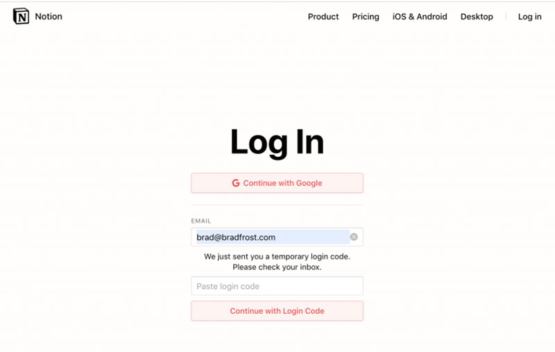
You’ve probably been through this process at least once: you access the login page, type in your credentials, and hit “Create an account”. Suddenly, you receive a mail with a temporary password that looks something like this: “akj1265lkFJ”. Then, you have to return to the website, use your email and the temporary password, and then change it with one of your choices. The process is indeed secure, but it is time-consuming and it often leads to people giving up. Keep the login page simple and the form even simpler.
To keep your users happy, make your login forms simple and smooth, design the page properly, and give users the direction they need to access what they want. Differentiate the Sign Up/Sign In buttons and accentuate important features such as “Forgot your password?”, “Remember me”, or “Show password”. A login page is a paramount component of web design, so pay careful attention to how you put it together and your users will thank you for it.
If you enjoyed reading this article about Do’s and Don’ts of Login Page Design, you should read these as well:
The post Login Page Design: Do’s and Don’ts appeared first on Amelia Booking WordPress Plugin.
As a small business owner, you probably use Microsoft Office programs such as Word and Excel on a daily basis. These programs are great for keeping track of your financials, sharing documents with staff, and sending contracts, invoices, or receipts to potential clients and customers.
But what happens when you need to collaborate on a project or present your business ideas for the next quarter? In those cases, you would need a program like Microsoft PowerPoint that’s better suited for presenting and pitching ideas.
In this post, we’ll explain what PowerPoint is, show you how you can use it in your business, and share 10 PowerPoint tips that will help you create presentations with a punch.
Related: What is Office 365 and how can it help small businesses grow?
PowerPoint is a part of Microsoft Office.
It’s a slideshow presentation software with built-in themes and templates paired with a suite of familiar editing tools that allow you to collaborate and present your ideas in a visually dynamic and creative way.
Editor’s note: The right tools make all the difference. Office 365 from GoDaddy includes PowerPoint, which enables you to create, edit, view, present and share beautifully designed presentations.
If you’ve used another MS Office program such as Word or Excel, you’ll know how to use PowerPoint. Once you launch the program, you’ll see a familiar interface where you can change fonts and font sizes, add shapes, insert images, and more.

There are a variety of ways to use PowerPoint — from creating a slideshow to present your newest marketing idea to designing a pitch deck for potential investors and getting seed capital for your startup or small business.
While PowerPoint is not used as often as Word or Excel, it’s still an easy-to-use program that has quite a few different and useful applications for small businesses.
The most obvious way to use PowerPoint is to share ideas that will help grow your business. For example, you can create a presentation to present a new marketing plan or to explain the vision you have for the business going forward.
You can also use PowerPoint to design a pitch deck for potential investors.
Use it to gather and present important information about your business, the vision you have, as well as goals and projections for your business.
A professional presentation that clearly outlines your idea and vision is more likely to get investors on board than simply hearing about it without any stats or information to back it up.
Another creative way to use PowerPoint is for client projects. You can use PowerPoint to create a summary of what has been discussed during an onboarding or strategy call, followed by your ideas or plans for executing their project.
Use PowerPoint to create an onboarding presentation for new employees.
You can include slides that share the most important information about your business, brand guidelines, and company culture. You can also include information about company policies and even save the PowerPoint presentation as a PDF that you can share as a handout or simply share it online so employees always have it handy and can refer to it as needed.
Lastly, consider using PowerPoint as a collaborative, digital whiteboard where all members of your team can brainstorm or work together on a project.
Not only can you share the presentation with team members, but they can also leave comments and suggestions as well add their own input and ideas to it.
This allows you to keep all the ideas in one place, have the presentation always accessible, and make it easy to keep the presentation updated as the project evolves.
Now that we’ve covered what PowerPoint is and how you can use it in your business, let’s go over a few important PowerPoint tips that will help you design awesome presentations for your small business.
These 10 PowerPoint tips will have you designing the most engaging presentations in no time!
Follow these 10 PowerPoint tips to make sure your presentation is a success.
The first and most important rule is to prepare a script for your presentation. While this tip seemingly has nothing to do with design, the truth is you will have a much better idea of how to structure and design your presentation when you know what you need and want to cover in your presentation.
Once you have established the flow of your presentation, you can go on to plan the structure of your presentation slides. At a minimum, plan to have a title slide, an intro slide, one slide for each main idea, and a slide with a call-to-action or the main pitch of your presentation.
According to Silicon Valley venture capitalist, marketer and author Guy Kawasaki, your PowerPoint presentations “[…] should have ten slides, last no more than twenty minutes, and contain no font smaller than thirty points”.
Unlike Word, where you can get quite descriptive with your text, PowerPoint is used more as a tool to support your story and to help you get your ideas across.
Avoid using literal text that you will wind up reading out loud to your audience and focus on using bullet points that will keep your presentation short and to the point.
Even though your PowerPoint presentation shouldn’t have a lot of text, you still need to choose your fonts carefully. Make sure your fonts are legible so your audience can easily read the text.
Avoid using script or decorative fonts as they can be quite hard to read and instead stick to serif or sans-serif fonts.
If possible, consider using your brand fonts to infuse your brand into your presentations.
Related: Everything you need to know about creating a brand style guide
Another PowerPoint tip is to consider your font size. If your text is too big, the text will dominate your screen and make it harder for your audience to focus on what you’re saying. If your text is too small, nobody will be able to read it. A general rule of thumb suggests you should aim to keep your font size around 24 pt.

As mentioned earlier, PowerPoint has built-in themes or color schemes that you can use to make your presentation more visually appealing. The problem with these themes is that they are rather generic and won’t make your presentation stand out.
Instead of relying on built-in PowerPoint themes, consider creating your own theme that will reflect your brand and help you build brand recognition.
Use your brand colors and fonts to create a unified, branded look for all your PowerPoint presentations.
Editing a PowerPoint theme is easy.
With PowerPoint launched and your presentation open, click on the Design tab. In the second column at the top, click the downward arrow and then Colors > Customize Colors.
You will then be able to customize colors for text, backgrounds, headings, links, and more. In a similar fashion, you can tweak the background and the fonts used in the presentation.

When you set out to create a PowerPoint presentation, building each slide from scratch can be time-consuming. To save time with your PowerPoint creation, use the built-in slide layouts and templates.
Since everything is predesigned for you, you don’t have to worry about creating a layout from scratch and you can focus on making sure the content of your presentation is top notch.
To access the layouts, all you have to do is click on Insert > New Slide and then choose the layout from the drop-down menu.
 Another way to save time while designing your PowerPoint presentation is to use a built-in template. PowerPoint gives you a choice of templates once you launch the program but you can also access additional templates by using the search box at the top of the screen.

Your slides will look much better when you make sure the content and visual elements are aligned consistently.
Your text should be left or right aligned as a center-aligned text is hard to read and will make your presentation harder to follow.
In a similar fashion, make sure the images, graphs, charts and other visual elements follow the same alignment hierarchy. You’ll notice that as you start dragging elements, guiding lines will pop up that will help you keep consistent alignment and spacing on each and every slide.

Visuals such as images, graphs, charts, and icons can not only make your presentation more visually appealing, but they can also help you enhance your story and make it easier to understand.
For example, background images on title slides can help your presentation stand out and stay on brand.
Icons, on the other hand, can add extra appeal and make your bullet points or titles stand out more.
However, be careful not to overdo it as too many different elements on a single slide can make your presentation appear cluttered and lead to information overwhelm.
If you want to make sure your presentation stays on point and keeps your audience engaged, stick to one idea per slide. Packing too much information into one slide leads to information overwhelm which will make your presentation weak and your audience will not only lose interest but they will also have no idea what the presentation was all about.
Contrary to that, sticking to one main idea per slide will ensure that you stay on topic, make it easier for your audience to focus, and have a better understanding of the idea you’re presenting.
If you plan on creating many PowerPoint presentations, plan on saving and reusing slider masters. Slide masters control the design of your PowerPoint presentation. This is especially useful if you want to use the same layout for title slides each and every time or make sure that your logo appears in a certain position on each slide.
Reusing and editing slide masters will save you time so that every time you need to make a design change, you will only need to make it in one place instead of going back and updating each individual slide.
To edit slide masters, go to View > Slide Master. You will to see all the slide masters that your presentation uses which control designs for multiple slides.
To create a new slide master click on View > Slide Master and then click Insert Slide Master. You can then change the style, add shapes, define font styles, and more.
Lastly, avoid overusing special animation or transition effects. A subtle fade transition between slides is fine and more than enough.
Not only does this distract your audience but it also makes your brand and business appear less professional, which can ruin the presentation as a whole.

Similarly, avoid using every single animation effect for text that PowerPoint has to offer. Just like transitions, they can be quite distracting and annoy your audience instead of presenting your business in a professional manner.
Designing powerful presentations is easy once you know how to use PowerPoint and understand the basic design principles that make a great presentation.
With the 10 PowerPoint tips outlined in this article, you’ll be well on your way to creating presentations with a punch and successfully sharing your ideas.
The post 10 PowerPoint tips to create presentations with punch appeared first on GoDaddy Blog.