Designing a login page can be difficult if you don’t know where to start. There are many teeny-tiny details that can be overlooked and ruin the user experience, preventing the onboarding of new users. When you have no starting point whatsoever, it pays to get up to speed with the basics of login page design regardless of the type of website.
Those who want to build a beautiful and responsive login page should read this article thoroughly and pay attention to all the aspects discussed below. The good news is that login pages are not difficult to build, as long as you follow some basic rules. Learn below more about this topic in this article created by our team at Amelia.
The Importance of Login Page Design
Before jumping into the do’s and don’ts of login page design, you should know what these pages do in the first place. A login page is a door that users must open in order to get the best out of their experience with a website. It is the starting point of navigating a website in a personalized manner. By creating an account on a website, you get to customize some aspects of your experience with the site and get access to membership benefits.
Well-designed login pages should inspire a sense of security. A poor login page will immediately influence your conversion rate because people are not going sign up in the first place. Designing a login page properly is a condition of owning a website, considering that this page is most likely to be accessed by users at least once per browsing session. People who want to access their accounts can’t do it without reaching the login page, and if this page is not designed properly and it’s a pain to use, you’ll lose users.
Once you’ve figured out how important a beautiful and responsive this page is, it’s time to learn how to create a login page that makes users stay on the website and enjoy their experience. Here’s the list of do’s and don’ts:
The Do’s
Keep it clear
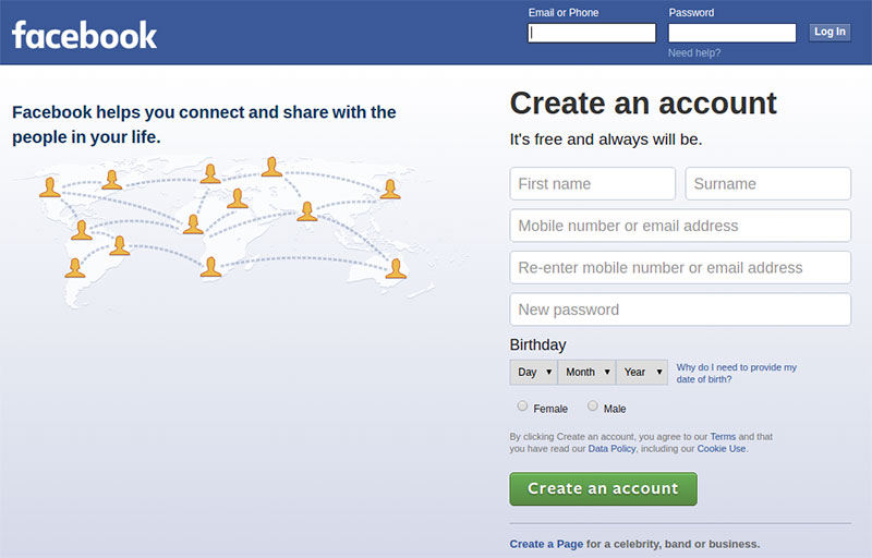
You can’t go wrong with a simple login form and clean design. Cluttering the page and making the login forms difficult to notice or to reach will make users leave the website. Try to keep the area simple and make it starkly visible, so that visitors can find it fast. Instead of creating a Log In/Sign Up button and redirecting users to a new page, you can incorporate a CSS login form on the homepage, to make it prominent and eye-catching, as well as convenient to use.
Distinguish login and registration
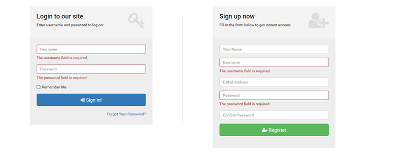
Some login pages don’t make a clear distinction between the login form and the registration form. Signing up requires gathering more information from the person who wants to create an account while logging in requires using your previous credentials and accessing your website. You need to make a clear distinction between the two, to avoid confusion. For instance, if a person tries to log in by using the registration form, they might get redirected to a page that has nothing to do with logging in, but instead asks them to sign up again.
Logging in with external accounts
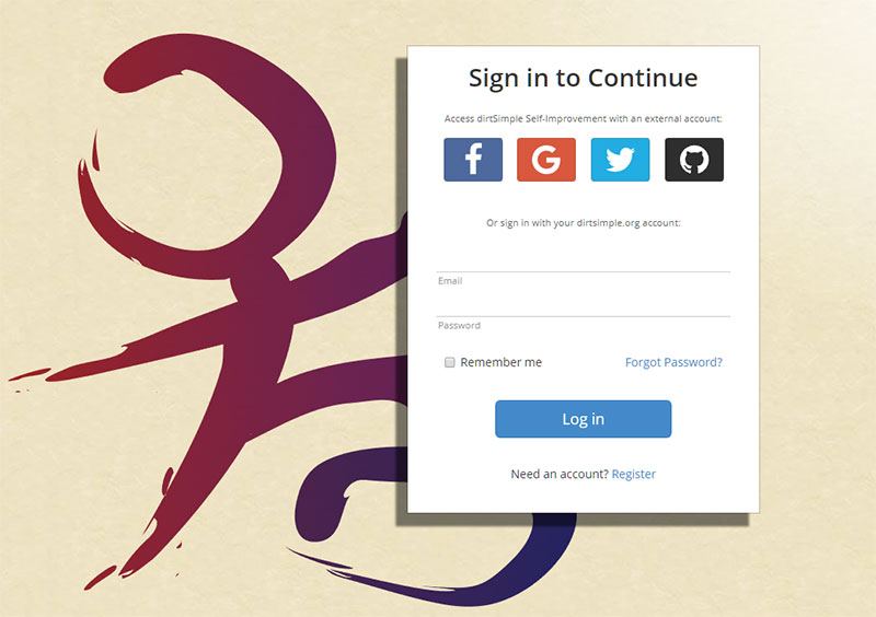
Taking into consideration that some people want to create an account as fast as possible, you need to give them plenty of sign-up options. Your login page should contain an option that lets people sign up on your website using an external account. This way, they won’t need to go through the lengthy registration process to make a purchase or add a comment on your site. Add options for linking with Facebook, Google, or Twitter accounts. Keep in mind that you may no longer receive all the contact details you would normally require through a registration form.
Add a “Forgot your password?” option
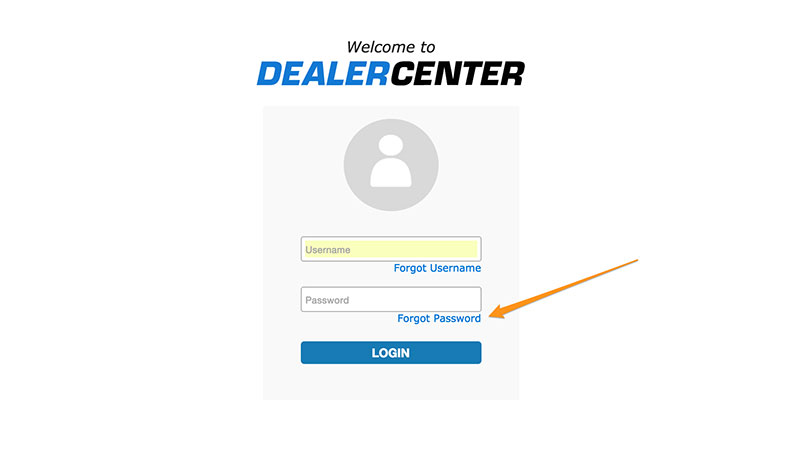
People forget their passwords quite often, and it would be a hassle to contact support just because you don’t remember yours. This is the reason why you’ll have to implement a “Forgot your password?” function. When users click it, they should receive a link in their email that lets them change their credentials and log in to the website without further issues.
Solving the Caps Lock issue

Mistyping the password is a common practice, and it mostly happens because Caps Lock is on. As you may have noticed while using other websites, some login forms let people know if their Caps Lock is on, to avoid making typos while writing. This is a very helpful feature for websites that restrict the number of times an incorrect login can be entered before locking the user out.
Add a “Remember me” option
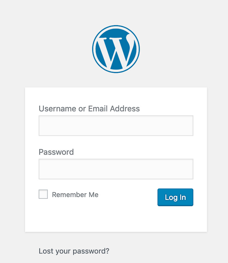
To reduce the number of people who request to change their passwords because they forgot them, it would be best to add a “Remember me” option at the end of the login form. Once checked, this option saves the credentials and each time that person accesses the page, their email and password will pop up in the form, or they will show up as already logged in.
Solving the mistyping issue
Even though the “Caps Lock” solution is effective, you can also implement an option that unmasks the password while typing. If the unmask option is checked, the user will be able to see what they type in the field. If it is left unchecked, the traditional masking symbols will appear instead.
The Don’ts
Similar “Sign In” and “Sign Up” buttons
This image presents the wrong way of designing the Sign In and Sign Up buttons:
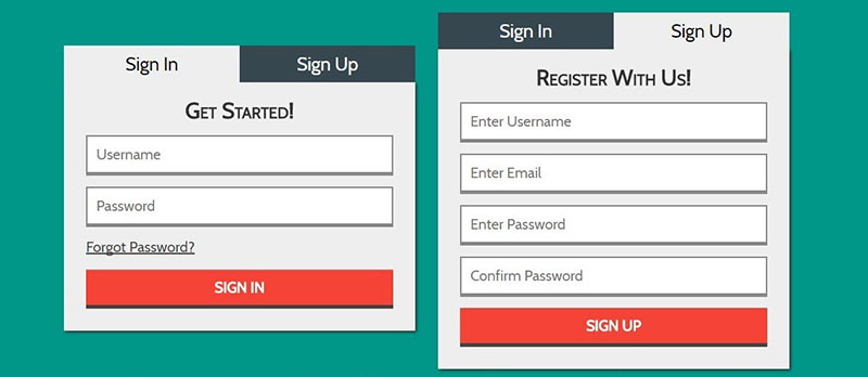
Instead of making them very similar, it’s best to differentiate these buttons and make it easy for the users to do what they’ve accessed the website for – to either log in or create a new account. Clicking one instead of the other by mistake could lead to a poor user experience by confusing the users and making them leave the website without further interaction. Use color, size, or some other contrast technique to make them visually distinct.
Modal logins
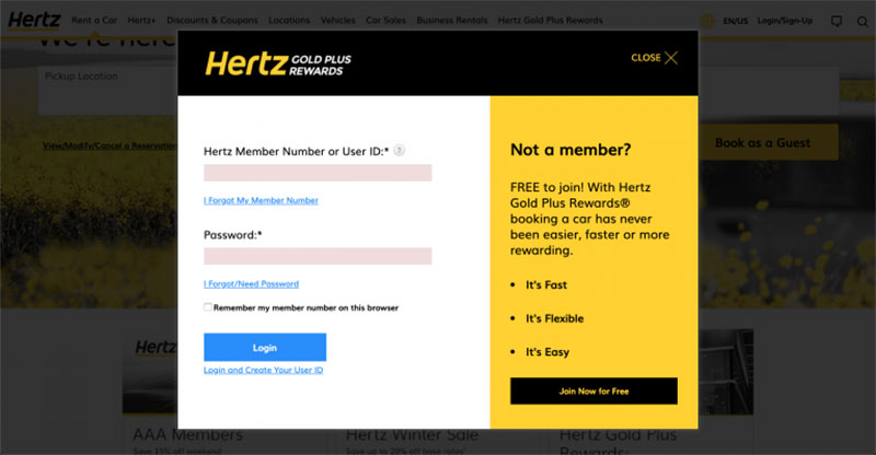
Using modal or tabbed logins is not a good practice because they require more steps from the user. They will need to click on the expandable menu, select login, and then fill out the form from there. Instead, a login page should contain the Sign In/Sign Up options separately. Moreover, modal logins might lead to more customer support demands, as users may get confused as to how to find the Sign In form (which may not be obvious).
Hidden fields
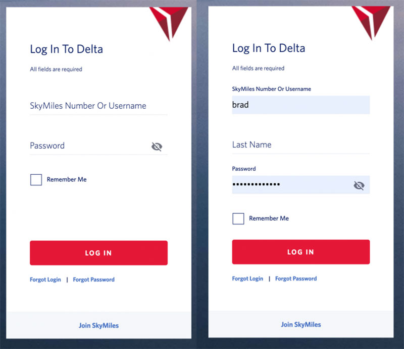
Hidden fields shouldn’t be hard to find or tricky to use. Some browsers can retain information that users type in when they register on a new website. To make the process easier and faster, the browser automatically fills fields that it recognizes, such as name, surname, address, phone number, and so on. If some fields are hidden or can only be accessed via a drop-down menu, the browser won’t be able to recognize the fields and autofill them. Most login page templates look the same, so try not to stray too far from the conventional elements of such a template.
Asking for a username instead of email
In login form design, it would be recommended to ask people to sign in using their username instead of their email. This practice is not efficient because people are very likely to forget each username they use for each particular website they’ve accessed lately. Instead, using their email can’t go wrong because it remains the same regardless of what website they navigate on. This is not a general rule, but it is a better practice that is proven to generate less customer support requests.
Restricting long passwords
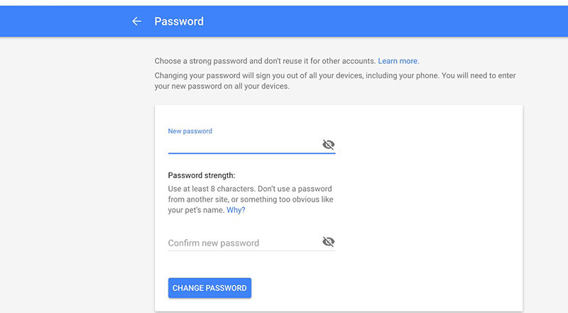
Taking into account how important cybersecurity is today, passwords should be as long and complex as possible. If your login page limits users to using an eight-character password, they might give up registering because their account won’t be as secure as they would like. Make sure that you set no max limit (or the highest possible) to the characters when users pick their password. This is a detail that could make the difference between gaining a user and losing one.
Overcomplicating things
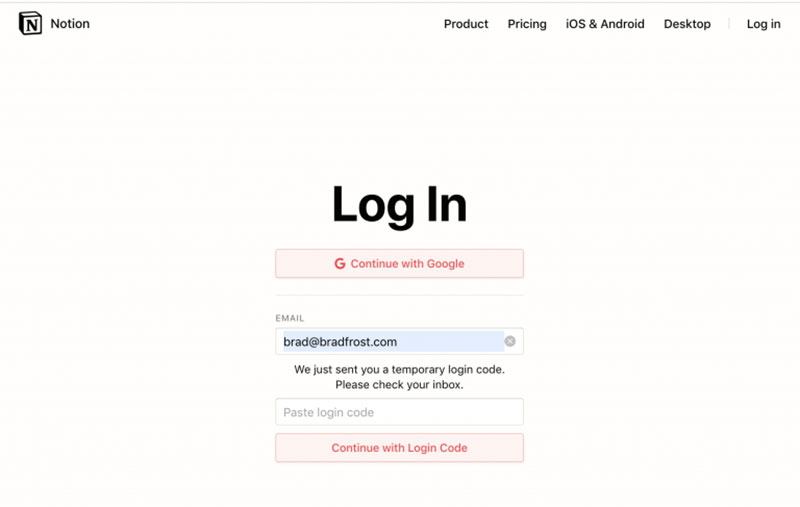
You’ve probably been through this process at least once: you access the login page, type in your credentials, and hit “Create an account”. Suddenly, you receive a mail with a temporary password that looks something like this: “akj1265lkFJ”. Then, you have to return to the website, use your email and the temporary password, and then change it with one of your choices. The process is indeed secure, but it is time-consuming and it often leads to people giving up. Keep the login page simple and the form even simpler.
Keeping everyone happy
To keep your users happy, make your login forms simple and smooth, design the page properly, and give users the direction they need to access what they want. Differentiate the Sign Up/Sign In buttons and accentuate important features such as “Forgot your password?”, “Remember me”, or “Show password”. A login page is a paramount component of web design, so pay careful attention to how you put it together and your users will thank you for it.
If you enjoyed reading this article about Do’s and Don’ts of Login Page Design, you should read these as well:
- How to Design the Best 404 Page Ever
- The Ultimate Website Design Questionnaire Template
- How to create a booking website with great user experience
The post Login Page Design: Do’s and Don’ts appeared first on Amelia Booking WordPress Plugin.