Everyone has a favorite color or a color palette that they prefer, and it tends to affect the choices made in their daily lives. Designers know this, and as a result, work to evaluate a color scheme at the start of a project.
Although color can be seen everywhere, not long ago, the only televisions available to the general public were in black and white. In more recent years, the yellow color palette has grown in popularity, as it uses bright, strong colors, that tend to bring feelings of happiness and calmness. In this article created by our team at Amelia, we wanted discuss how yellow has impacted our lives, and how the color can be added to yours as well.
Why choose a yellow color palette?
Some people may view the yellow color palette as too bright, but when used correctly, it can inspire many different ideas. The most obvious one being warmth.
Yellow not only offers a cozy effect, but it is also often viewed as cheerful. It stimulates people, and a lot of times, it is associated with food. Pure yellow can be very strong and can be used to get the attention of users.
If you are wondering what yellow symbolizes, the answer is quite simple. It stands for hope, confidence, and imaginative designs.Still, when yellow is overused, it may not look appealing. To balance this, you will need to incorporate colors that go with yellow, but will not be overwhelming.
As it represents the color of the sun, yellow can bring happiness and fun aspects. It is also responsible for activating the anxiety area in your brain. This is why it should be used cautiously. Remember to go for a darker color as a contrast.
Yellow Color Palette Website Examples
Sikkema

This is a more feminine website that is focused on the associations of warmth and brightness of the sun. The website color scheme consists of several nuances of a vivid yellow, and it looks quite cool.
Creative Spark

This site has a yellow color palette and also brings some shades of grey and blue into it. The smart use of colors, together with design elements, makes it successful in sending its message to the viewers.
Lordz

The best color palette to go with for this website was yellow. As we are talking about the Swiss Urban Dance Academy Lordz, we should expect it to have a great design. The yellow color schemes keep viewers energized, and the animations that are in it also do a great job.
Pittori di Cinema
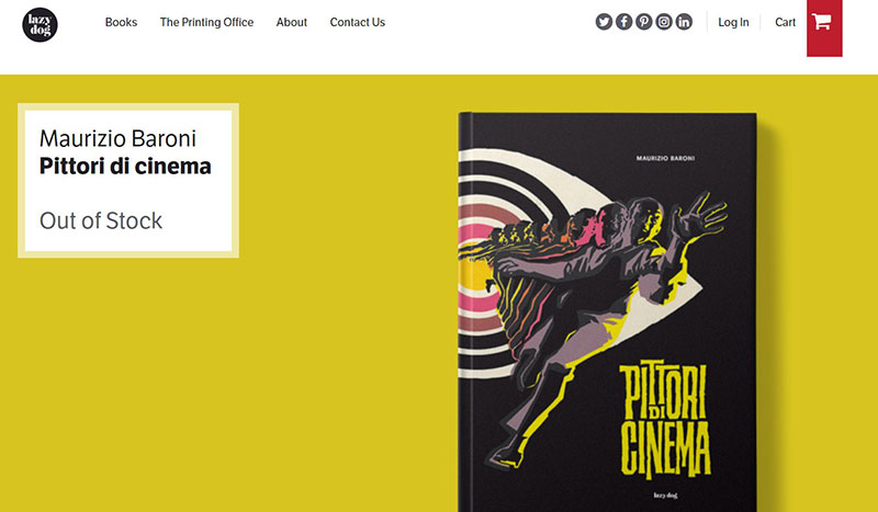
Who said minimalism could not use strong colors as well? The yellow color palette in this website looks great and blends in perfectly with the design part.
The Robin Collective
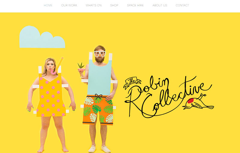
This is a creative mix gives a magical view of color when entering the website. The yellow palette brings positivity and sunshine to the viewers. The additional shades of blue and orange go hand in hand with the rest of the elements. When the artist deals with highly saturated colors such as yellow, he knows to add some neutral tones that balance the entire effect.
Hlvticons
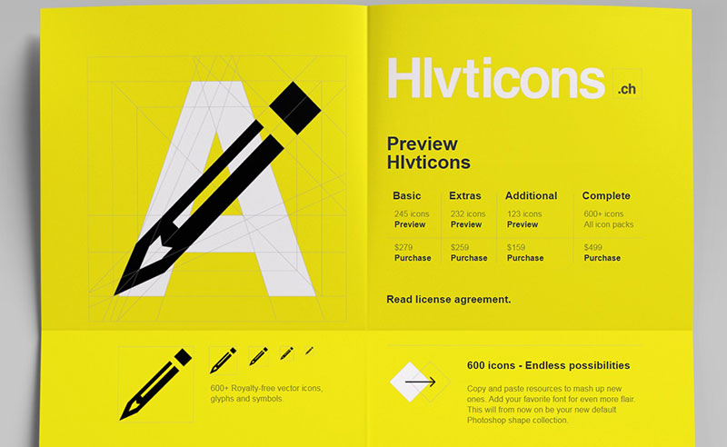
This color palette from Hlvticons has a combination of the three colors yellow, white, and black. Not only do they look great, but they are also great for inspiration purposes.
Siteleaf

The nice, yellow color palette that is used on the Siteleaf site can be perfect to use for a natural, white background and dynamic, dominant color. It looks great, and the different grades of color bring a nice design. It is not that complicated to obtain a similar effect, so designers can check it out to understand what is going on in there.
Collectif-yay

YAY represents a graphic design collective that features a vibrant website. Although the layout contains a simple layout with a yellow color palette, if you keep scrolling, you see how the background color changes.
The black typography goes well with the rest of the elements. The website looks good, and it mixes colors in a very creative way. They did a great job also with the menu interface. It can be a real inspiration model, so keep it in your list for future references.
Yellow Bird Project

This is a great example of how colors that compliment yellow can direct your eye to certain links on the site. The cool aspect of this is it does it without overwhelming you. Contrasting black boxes, together with a black logo, offer the needed balance. We can also see a bright aqua-green being used that brings another dimension to use. It is simple but creative at the same time.
Assiko
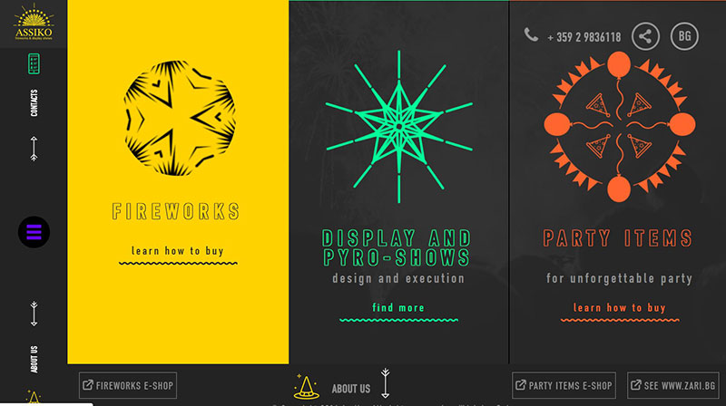
This is a simple combination of a yellow color palette mixed with orange and dark gray. It does a great job of grabbing your attention, and it shows that smart color combinations can also be used when you want to bring an audacious look in front. It is one of those examples that shows colors that match with yellow and do a great job of featuring a brand online.
MA True Cannabis
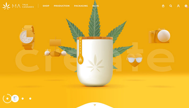
This website has vibrant colors that create a powerful combination. Together with its design elements, the website brings a nice, lost-lasting impression together with a warm feeling towards the viewer. Anybody that is going to check it out is going to be impressed by what they see on the site.
Adam Hartwig

Another website that takes advantage of the yellow color palette is this portfolio. It belongs to a designer and developer that lives in the UK and specializes in interactive experiences for tablet, desktop, and mobile.
Created by Adam Hartwig, this website shows his creativity and what he can do. The website starts with a simple slideshow of unique hand-drawn elements that displays information about himself. We can see that more than one color is being used, but the main one remains yellow. Yellow is one of the first colors you see when you enter the website.
Bzzy

This bright yellow incorporates the idea of communication, and the site looks great because of it. What could be a better choice for a text-messaging app? As this brand wants to stay consistent, it matches up to its product through all its communication channels.
Together with the yellow color palette, it also uses a red that goes nicely with the black images and font. It is an excellent source of inspiration when you want to try different colors that go well with yellow.
Snipcart

On this website, we see that a gray is being used to set the tone as the primary background color together with subtle yellow accents. The choice goes hand in hand with a bright color that has a subtle and neutral gradient for a color palette that encourages the user to go towards the content and explore it.
This is a great way of using colors to make users explore more the website and what it has to offer.
Frankie Ratford

At first glance when checking out the website of Frankie Ratford, it is clear that the person featured in it is full of energy. We can notice this because of the color choice that has been made. The yellow color palette brings a great energy, and when the other colors are added, it makes the site feel more minimal. This is due to the use of black to balances it out.
Croscon

The website of this company has yellow graphic elements on large images with a white overlay. The large black typography looks great and forms a friendly web design example.
ICO Syndicate

This combination of yellow color palette together with softer hues creates a nice experience on this website. The colors used are:
- Floral White
- Banana Mania
- Safety Yellow
- Mauve
- Rich Lavender
Mooze Design
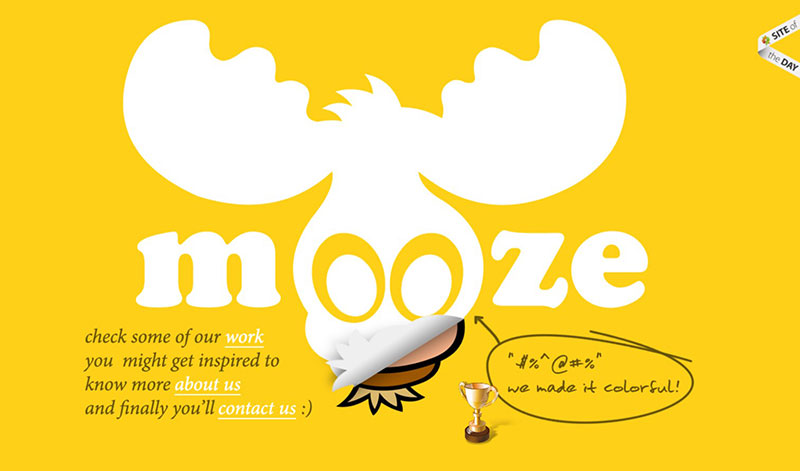
This site is very bright and utilizes both a golden tone and a grey one. It manages to create a nice contrast that viewers can really appreciate.
12 Dishes
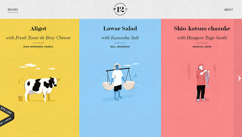
The simple color combinations on this site make it look elegant and engaging at the same time. Just give it a check and see how the yellow color palette has been used ingeniously.
Loic Sciampagna Portfolio

The combination of blue and yellow looks interesting on this site, and the contrasting hues are simple, elegant, and engaging. With this simple touch of light, some nice vibes can be achieved.
Mambo Mambo

If you want to see a website that takes advantage of the bold, yellow color palette, then you should take a look at Mambo Mambo.
Our Wildlife Garden
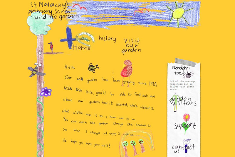
Yellow is known for being a color that children prefer. Bright colors attract children, which seems to be the inspiration behind this website.
Best Buy

As we continue, we absolutely had to add this website to our list. The way the yellows are being used is smart, and visitors are going to be impressed by it.
Pennzoil
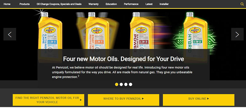
Concluding our list, we reach Pennzoil, who also use the yellow color palette. See what they did and how the elements balance each other.
If you enjoyed reading this article about the yellow color palette, you should read these as well:
- Rules of Website Layout Design Every Web Designer Should Follow
- Guide to Opening a Gym and Starting a Successful Gym Business
- The Best Medical Appointment Scheduling Software You Can Get
The post Websites with a yellow color palette that looks awesome appeared first on Amelia Booking WordPress Plugin.